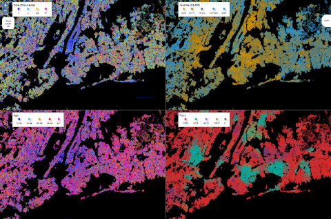
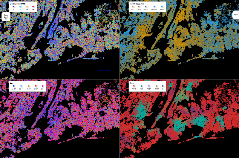
 A team of developers at non-profit based RTI International has developed a new way to view census data. Their product consists of a map that shows different demographic patterns in an interactive format. The power of this data is just being realized by health professionals. Public health officials and others can access the map to identify areas where a community education forum might be useful to help prevent diabetes or other ailments that are historically clustered around certain demographic populations.
The census data used to construct the map includes data from more than 280 million individuals living in 112 million households throughout the country. Unlike Google Earth that shows exact locations in great detail, this map does not reveal a household’s exact location for privacy reasons, but rather makes a note of locations with dots on the map. In addition to being able to look at how socioeconomic components may affect incidents of certain diseases, the map can also be used to track the spread of disease across a variety of factors such as ethnic background and income level.
The new map technology may also have strong applications for public health policy makers and others advocating for resource allocations to address needs that are specific to distinct populations. For health practitioners looking to set up a practice, the map can also show areas that may need health professionals with certain specialties, such as pediatrics. For medical professionals already in private practice and looking to expand their services, a look at the map can reveal what kinds of professionals the public may find complementary to an already trusted group of providers.
This new tool could also prove fruitful for health professionals who are job searching. Through looking at a wide variety of demographic data, professionals can concentrate a job search in areas where the population matches an area of expertise. Best of all, the map (also called the Synthetic Population Viewer) is available for free with a single click.


